Let’s start by defining our terms.
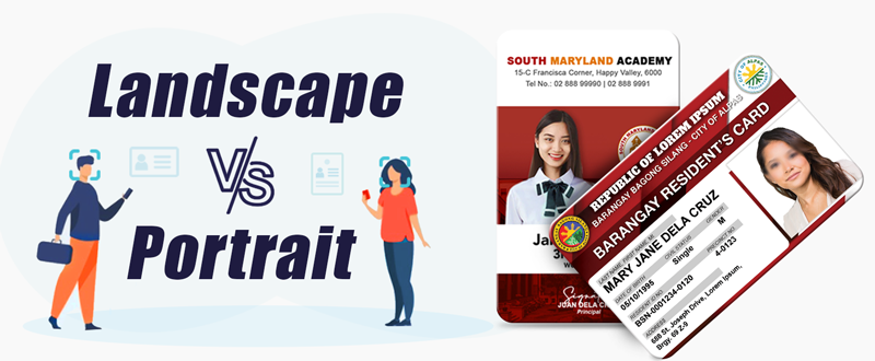
Landscape refers to the orientation that is wider than it is tall. (Horizontal Layout)
Portrait is taller than it is wide. (Vertical Layout)
Designing ID cards can be displayed landscape (horizontally) or portrait (vertically). The orientation of your ID cards will impact how they are used and differ in content value. Many companies utilize both orientations.
Let's explore both portrait and landscape orientations.
Portrait
- These are better for photo ID card badges (student badges, badges of the sales staff in the shops, badges of exhibition and other different events visitors).
- This layout is great for those that want to keep it simple with minimal text, a photo and a nice company logo.
- Worn only as an ID card requiring limited cardholder data.
- Printing large readable fonts for single line data is restrictive with a vertical design
Landscape
- These are carried in a purse or pocket (e.g., bank cards, membership cards, loyalty cards).
- It allows for a little more room in terms or text space.
- Longer logos or text fields will look better on a horizontal orientation since you won’t have to shrink the font size or wrap the text to fit in the allotted card space.
- Used with swipe readers.
- Horizontal formats are oriented better so the slot punch does not go through larger printed graphics on the top edge.
- Carried as a wallet item requiring detailed cardholder data.
- For membership cards, horizontal designs allow you to place larger amounts of data if needed.
Don’t Forget!
The simplest ID card designs are often the best. Avoid over-complicated designs with too many images or fancy fonts. Instead, focus on developing a clear ID card design.
If you would like to learn more about our ID layout or doing a customized ID design, give us a call! Our ID experts would be happy to answer any questions you may have about our products.


